Today the people of Britain saw the below picture and in a rare display of national unity shrieked as one: WTF?
Why, of course it's Wenlock, the 2012 Olympic mascot, and Mandeville, his Paralympic counterpart. I don't know about you, but when I see these two misfits lumbering terrifyingly down the street, I'm going to think "well this clearly encapsulates the spirit of the Olympic Games!"
What's that weird orange blob atop the head of eitherWenlockorMandevillelikeitmatters, you ask? Apparently it's a light in the style of those found on the Hackney carriage taxi for which London is so famous! And what better way to replicate the indication that a cab is for hire than by mounting a weird clitoris-type thing on top of a one-eyed maniacal monster, and sending him out to play with children.
And what's with the cyclops thing? Apparently that is not only an eye but also a LENS, which is a nod to the digital / webcam / iPhone generation. Groovy! It also signifies that the figures may be turned into cameras and camcorders when they go commercial in July. Needless to say, I think I'll stick with my trusty Canon, thanks.
Wednesday, May 19, 2010
Wednesday, May 12, 2010
Coalition Time
Monday, May 10, 2010
Sunday, May 9, 2010
Modern Masters on BBC1
Just finished watching the hugely enjoyable Modern Masters on BBC1.
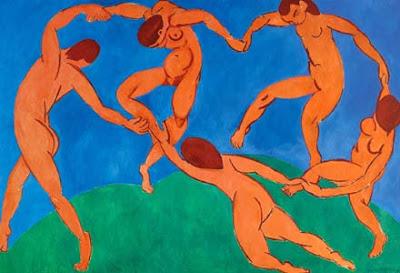
Alastair Sooke presented an hour-long look at Henri Matisse, tracing his biography across Europe, Russia and the US. The programme showed some of the painter's greatest works, and demonstrated how Matisse's vivid use of colour and form has influenced today's artistic and design culture, from Miffy books and the 2012 logo to iPod ads and Paul Smith ties.
The instant response on Twitter was highly positive. The only critcism, incredibly, was of Sooke's alleged insincerity. I couldn't disagree more. I'm highly skeptical of earnest TV presenters, but thought that the Telegraph art critic was excellent: confident, enthusiastic and likeable.
It's exactly what BBC programming should be about, and perfect for a Sunday night. Tonight's episode was second in a series of four - Warhol has gone but Picasso and Dali are yet to come. BBC1 at 9.00 p.m. next Sunday. Don't miss it.
Thursday, May 6, 2010
Tuesday, May 4, 2010
Penguin RED covers
Penguin is to release eight special editions from Penguin Classics series with specially designed artwork to celebrate a new partnership with (RED), the campaign to help eliminate AIDS in Africa.
Mr Christopher hearts Penguin design and three of the eight have been developed in-house. Strikingly, the title block is red rather than the conventional black, and the typographical visuals are quotations from each book. In a nod to the campaign branding, "Penguin Classics" is bracketed - a minor detail, but a nice touch.
House of Mirth is one of my favourite books, and the vintage Americana typefacing looks awesome, so ten points there. Bram Stoker's Dracula is fiercely dark and challenging - the text reads "His eyes were positively blazing. The red light in them was lurid, as if the flames of hell fire blazed behind them", but it takes a little work to make out. I also like the messy geometry on Conrad's Secret Agent, sprawling over the title block.
Here are the rest.
The only let-down for me is James' The Turn of the Screw - sparse, insipid and plain.
Subscribe to:
Posts (Atom)