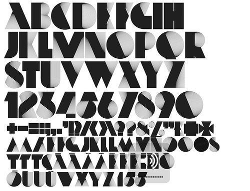
Hat tip: Yimmy's Yayo.


I Went to Banff To Say Yes To Everything
1 week ago
 Unfortunately, I wasn't overly impressed. While the fair featured inevitably beautiful pieces by Rob Ryan - the most popular name secured by the fair - I thought that the quality of the works on show overall was a little disappointing. This was an affordable art fair that showcased up and coming artists, so you expect there to be some unevenness, but for me, a few too many pieces were amateurish, sparse and uninspiring.

 Nobrow Press, a small publishing house in East London, produces fascinating tactile books and several of these were on display at the fair. Bright, bold and diverse, the prints leapt off the page and were amongst the most exciting works on show.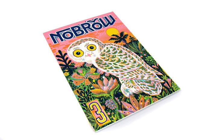

 Other standout works included Oranges and Lemons by Paul Bommer, Moustaches by Mr Bingo, Ice Creams by Paula Castro and Go For It by Alex Trochut (I also liked his Neo Deco typeface design). However, unfortunately overall I thought these jewels were few and far between.


 Why, of course it's Wenlock, the 2012 Olympic mascot, and Mandeville, his Paralympic counterpart. I don't know about you, but when I see these two misfits lumbering terrifyingly down the street, I'm going to think "well this clearly encapsulates the spirit of the Olympic Games!"
 In sneaks British Airways Pilot of the Year 2009, Nick Clegg.

 Alastair Sooke presented an hour-long look at Henri Matisse, tracing his biography across Europe, Russia and the US. The programme showed some of the painter's greatest works, and demonstrated how Matisse's vivid use of colour and form has influenced today's artistic and design culture, from Miffy books and the 2012 logo to iPod ads and Paul Smith ties.
 The instant response on Twitter was highly positive. The only critcism, incredibly, was of Sooke's alleged insincerity. I couldn't disagree more. I'm highly skeptical of earnest TV presenters, but thought that the Telegraph art critic was excellent: confident, enthusiastic and likeable.
 It's exactly what BBC programming should be about, and perfect for a Sunday night. Tonight's episode was second in a series of four - Warhol has gone but Picasso and Dali are yet to come. BBC1 at 9.00 p.m. next Sunday. Don't miss it.


 Here are the rest.


 The only let-down for me is James' The Turn of the Screw - sparse, insipid and plain.
 The Times follows with the shock news that most businesses try to make money, many sporting teams hope to win their various matches, and that some journalists stick "Exclusive" at the start of any headline to justify what would otherwise be a non-event story.


 Posts
All Comments
Posts
All Comments